
A Mobile App Making Public Spaces Safer By Harnessing User Safety Ratings
This application is a proactive, pre-emptive, revolutionary which makes the world a safer place to live in by creating a pre-emptive safety environment that nips incidences of violence and crime before they take place. It is a unique tool to know in advance whether a place is safe.
This will happen because the app will have safety ranked spaces. The community of women/men who have Phree will rate places and spaces according to how safe they perceive them to be. These ratings will be available to all users and will become a tool to judge how safe a place is.
The app Unleashes A New Power because Phree is a proactive App that enables users to better equip themselves with information and take charge of their own safety and that of others. The App unleashes a new power that enables users to express their experiences by rating spaces and establishments based on their personal or secondary experiences.
Government data shows that over the last ten years the safety of women has plummeted by 83%. This increase in violence against women is worrisome and an urgent solution needs to be found. And there was not other Woman Empowerment app which includes Safety Ratings, Consumer Driven, Differentiate AM and PM Ratings for safety and Location based safety ratings.
User and Audience
The community of women/men who are on the app will rate the places and areas and mark the areas in the app based on safety and suggest the routes and ways to commute.Application target audience was women/men who are working in some dangerous places where they feel insecure so that they can mark that particular area to aware others as well.
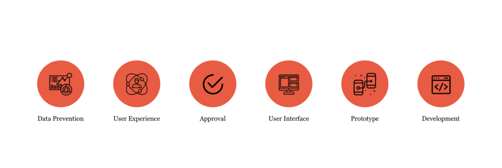
Rules and Responsibility
My responsibilities in this project was to create and maintain a unified and cohesive set of UI and Visual Interaction components from scratch that adheres to our new brand guidelines for both mobile and web platforms in an Agile environment.
Also, by implementing the design ideas using storyboards, process flows and sitemaps using Miro, Figma, Sketch and Adobe XD, I was Interviewing designers and contractors with the help of the hiring process.
On the other hand my another responsibility was to design user interface elements, design systems & standards communicating design to users, businesses, developers, and other stakeholders.
Also, developing UI mockups and prototypes that clearly illustrate how the site’s function looks and make them responsive.
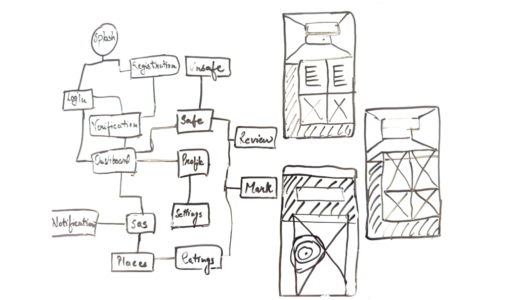
Low Fedelity Wireframes
There are some feature which stakeholder wants to be in it but I molded some features and they liked it. Here are some features below
- Safety Ratings displayed .
- Consumer Driven .
- Location Based Features – To search spaces and establishments based on their safety ratings.
- AM and PM Ratings for safety.
- One Click SOS – With the click of a button you can alert your designated contacts.
- Maps – A navigation tool
- Comments section.
Low Fedelity Wireframes
- I Started my research from the woman, who travel daily on local trains, buses or cabs that which kind of problem they are facing on their daily commute to work.
- By visiting several cafes and taking some interviews with people and my team member I got so many information which helps to create this product
- Did brain stroming on some similar products which are already in the market like noonlight, microsoft family safety and skera.
- And on the other hand, get documented everything on Microsoft Word to make some wireframes for this application.
Scope and Constraints
This App is based on user ratings. An entire street can also be marked. The safe areas can be marked based on the time, whether it is safe in morning, noon or in evening. The timings in the night can be marked, that it is safe from a particular time to a particular time.
The timeline was so limited and I have to complete the user personas, stories and research and apply on the low fidelity wireframes so that I can make their prototype for better hand on experiences. Also, the budget of this app was not that much good and I have to manage that as well so we decided to make this application as per IST Standard for the initial stage.
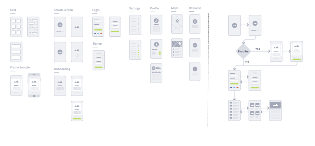
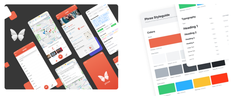
User Interface and guidelines
With the help of low fidelity wireframes with prototype client gave us feedbacks and based on that I made user Interface with Styleguide so that I can make High fidelity prototype and can hand over to the development team by using usability testing and move to the next phase of this product.
After done with Developing phase, again I did AB Testing and so that product launching should be perfect. And with getting feedbacks from client on User Interface and Style guide. We successfully launched our application on iOS and Play store. Also, there is a intro animation made which is in the application. On the basis of this application I also made website design (Phree) and a video for it. Which is made in After effects.